Adlib Software
A new brand identity for a software company moving into AI-driven content intelligence. Modern and friendly, without losing trust.
- Client
- Adlib Software
- Year
- 2020
- Disciplines
- Brand identity, Iconography, Brand guidelines, Launch materials
The brief
Adlib Software was taking a new corporate direction, with a focus on AI automation in content intelligence and unstructured data. The brand needed to support that direction and set Adlib apart from its competitors.
The identity
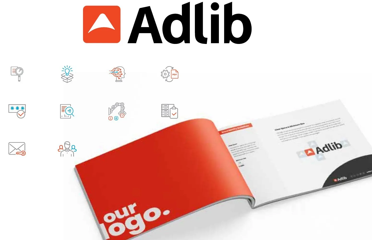
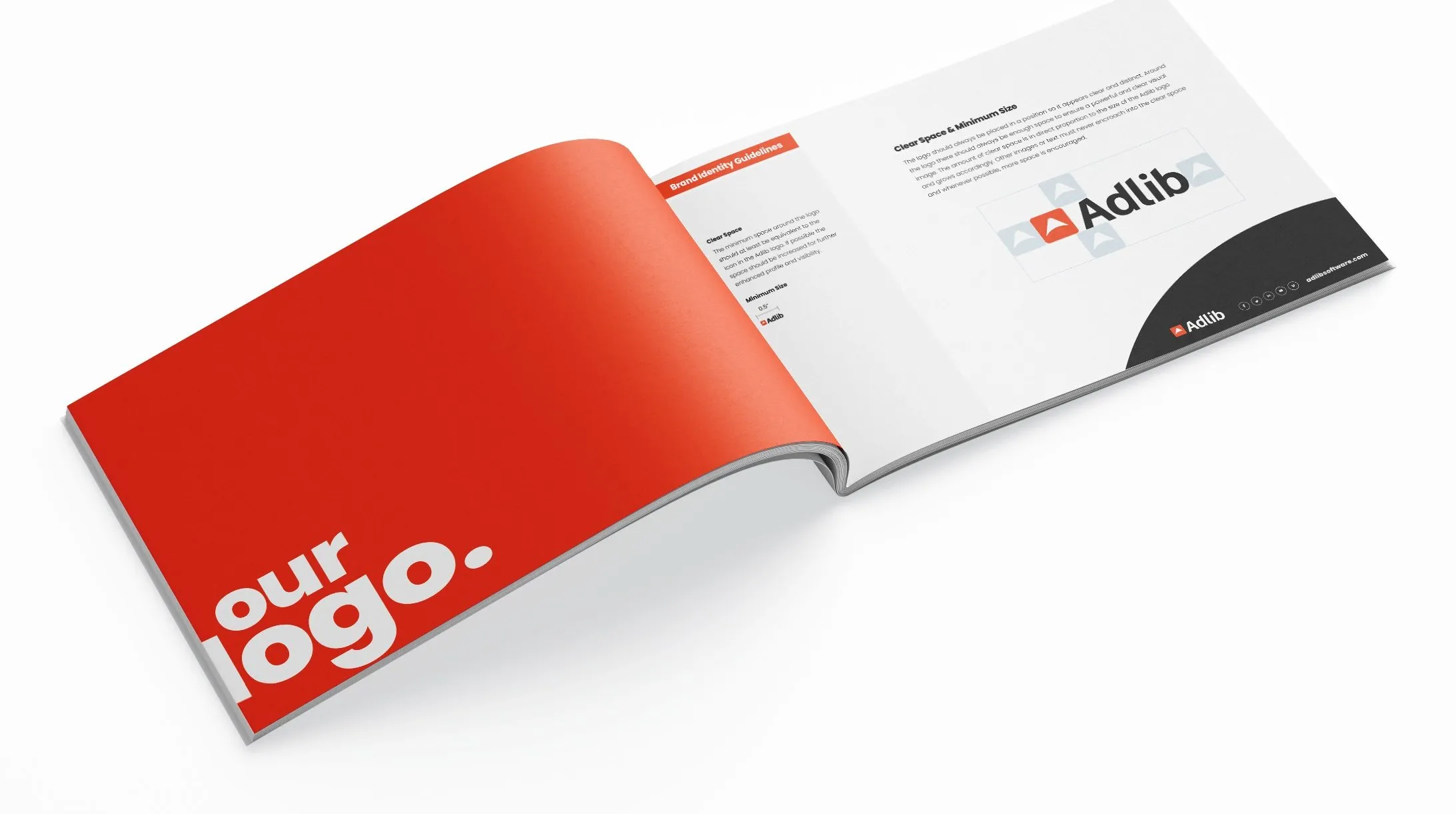
The new logo and identity bring a more modern and friendly quality to the company. The logo icon represents progression and movement. Carefully crafted letterforms sit beside it. Together they humanize the identity and make it proprietary.
The logo, colour palette and typography combine modern and classical characteristics. The company reads as progressive, and also as trustworthy and respectful of the norms of its industry.
The system
A custom set of icons supported the launch. The style is simple, straightforward and two-dimensional. Lines are grey by default with an orange accent. They reverse to white on a dark background, and a blue accent can be added from the brand palette.
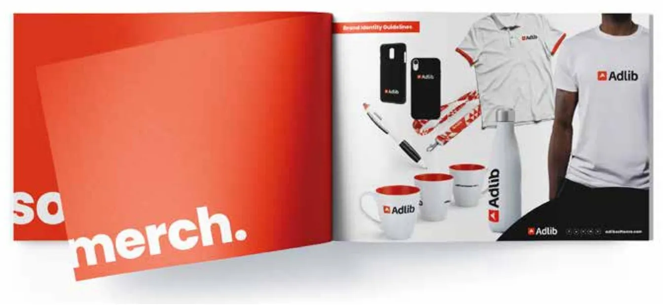
The launch included a new website, magazine ads, datasheets and white papers, e-books, an HTML newsletter, presentation decks, corporate merchandise and updated corporate graphics and charts.
Why it matters to me
Adlib was a design project about AI before I started building with AI myself. Making an AI company look approachable and trustworthy is the same problem I work on now with AI4Love.